¶ Introduction
On the energy page you have a complete overview of your energy consumption.
This page is divided into the following categories:
- Live: where you can see at a glance where your energy is going.
- Energy forecast: here you can see the best period to charge your car according to the predicted solar strength.
- Peak consumption: the introduction of the capacity tariff ensures that large peaks in consumption will be penalized via the bill. You can limit your peak consumption on this page.
- Energy insights: get insight on your energy consumption compared to the previous month here.
- Energy graphs: here you can view the energy consumption of all your consumers.
¶ Live
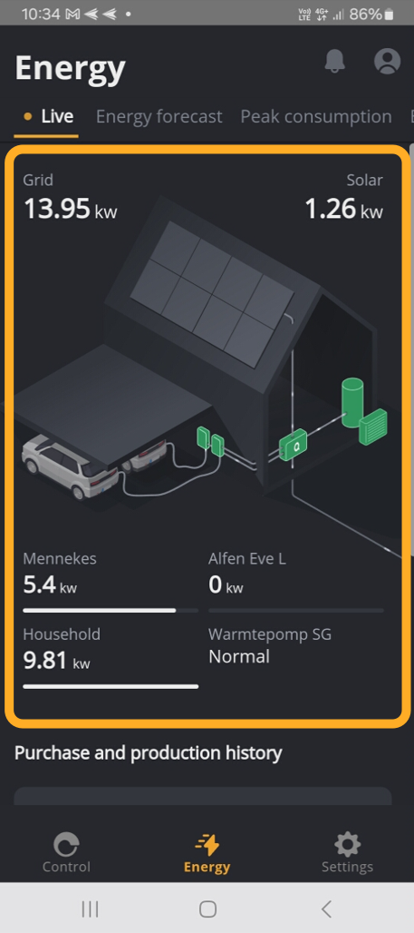
The image shows how energy flows in your home.
- Net: the energy you currently get from the grid.
- Solar: the energy your solar panels are producing.
- Charge posts: the energy that goes to your charging stations.
- Household: the energy the rest of your home is consuming.
- Heat pump: the condition of your heat pump.
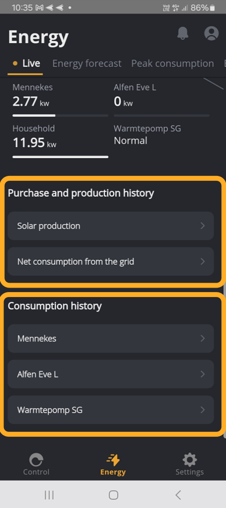
¶ Purchase and sale to the grid.
¶ Solar energy production
.jpg)
This page shows you how much energy your solar panels have generated.
- A green bar with a positive value has to how much energy from the solar panels you consumed.
- A green bar with a negative value has how much energy from the solar panels was left over.
- The orange line shows how much energy from the solar panels you consumed yourself.
Below the graphs you will see a total of:
- Solar energy production: How much energy have your solar panels produced for the chosen day.
- Own consumption: How much energy you have consumed yourself for the chosen day.
- Solar energy export: How much energy you have put on the grid for the chosen day.
And at the very bottom of the page, we can see for the past few months what % of our energy consumption we generated ourselves.
Tap a bar to see the percentage.
If you click on the calendar icon at the top right you can choose another day.
¶ Decrease from the grid
.jpg)
- On the graph you can see how much energy was taken from the grid.
- And below that how much energy was taken from the grid in total.
¶ Consumption History
¶ Charging poles
.jpg)
In this graph, you can not only see how much energy your car needed to charge, but also how much energy you needed from the grid and how much energy from your solar panels.
¶ Heat pump
.jpg)
Luqas also controls your heat pump automatically. Here you can see the status of the heat pump and make adjustments yourself if necessary.
¶ Energy forecast
.jpg)
Your Luqas module takes into account the predicted weather conditions. Based on the forecasts, Luqas will determine the most favorable moment for charging your car.
¶ Peak consumption
.jpg)
The introduction of the capacity tariff means that large consumption peaks will be penalized on your energy bill. On this page, you can monitor and limit your peak consumption.
At the bottom of the page, you can set the value at which Luqas should intervene. If the limit is about to be exceeded, the car charging process will be postponed.
¶ Energy insights
Thanks to the insights, you can compare how much energy was generated, consumed, and taken from the grid compared to the previous year.
At the top, you can select the month you want to review.

Each energy measurement has the following parameters:
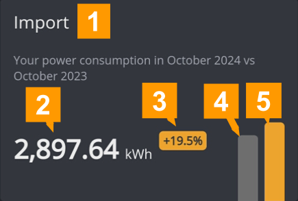
- The name of the measurement.
- The total value of the measurement for the selected month.
- The difference from last year.
- A visual value of the selected month for the previous year.
- A visual value of the chosen month.
¶ Insights
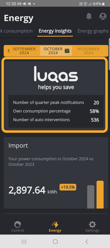
- Number of Quarter Peak Notification: how many times we notified you when you threatened to exceed the peak consumption value.
- Own consumption percentage: this percentage indicates how much of your energy consumption you generated yourself.
- Number of automatic interventions: the number of times the Luqas intervened to reduce your energy consumption.
¶ Insights about your appliances
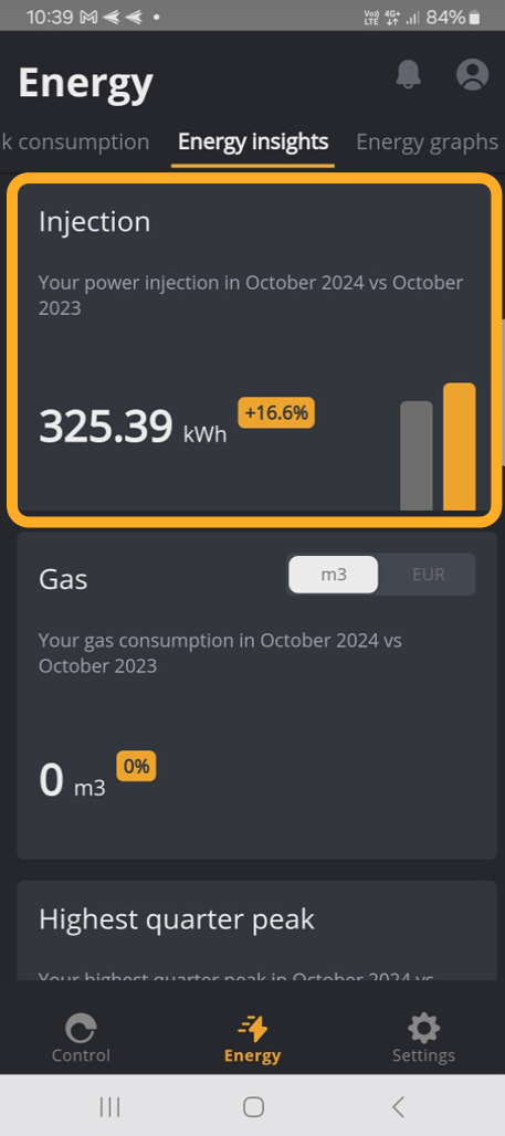
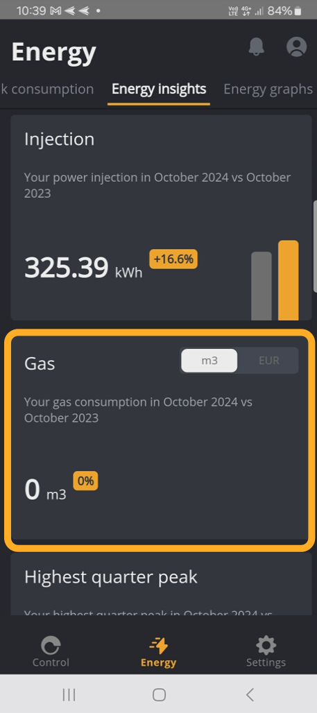
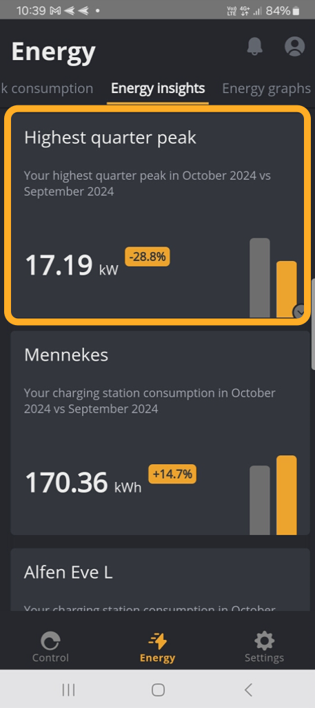
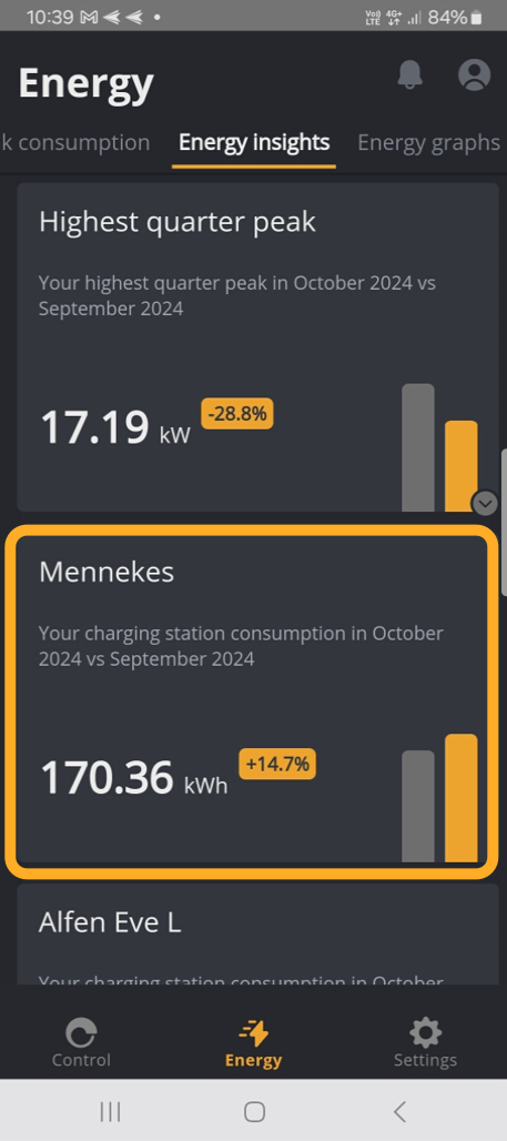
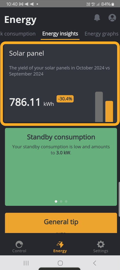
Shows how much energy you are consuming from your devices.
¶ Tips
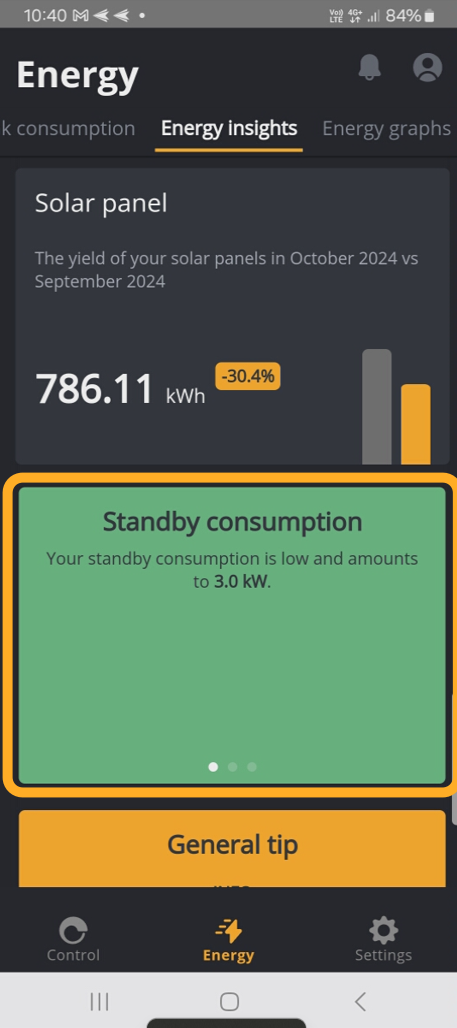
Finally, we also show some tips...
¶ Fun facts
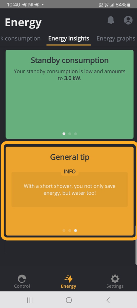
... and facts.
¶ Energy Charts
¶ Purchase/Injection Consumption
Consumption is expressed in kWh. Turning on the microwave for 5 minutes is 0.084 kWh.
.jpg)
.jpg)
.jpg)
¶ Day
Here you can see by hour what the highest consumption was for the chosen day. We see that we started taking energy from the grid a little before 9am.
- We also see the peak consumption of that day: 13,27kWh.
- and the lowest consumption: 3,51kWh.
In the bottom section you can read the day's total.
- Consumption during peak hours.
- The off-peak consumption.
- The injected consumption in peak hours of your solar panels.
- The injected off-peak consumption of your solar panels.
¶ Month
Here you can see per day what the highest consumption was for the selected month.
- We see that our solar panels generated the most on day 14 (131.64kWh)
- and the least on day 12 (28,50kWh).
We see in we weekdays mainly a decrease in energy, both in peak and off-peak hours.
On weekends we have a decrease in off-peak hours and there is still enough output to inject back into the grid.
In the bottom section you can read the monthly total.
- The off-peak consumption.
- The off-peak consumption.
- The injected consumption in peak hours of your solar panels.
- The injected off-peak consumption of your solar panels.
¶ Heat pump
.jpg)
.jpg)
.jpg)
Here you can see the hourly consumption of your heat pump for the selected period.
¶ Current
This graph shows the progression of current, by phase.
.jpg)
.jpg)
.jpg)
Here you can see for the selected day what the measured power was per hour and below the average power consumption for the selected period.
¶ Gas
This graph shows your gas consumption.
.jpg)
No measurements available, but idem as electric consumption.
¶ Charging Station
This graph shows how much energy your electric vehicle consumed.
.jpg)
.jpg)
.jpg)
Here you can see per hour what your car consumed and at the bottom the total consumption of the selected period.
¶ Year
Here you can see by month what the highest consumption was for the chosen year.
- We see that our solar panels generated the most in the month of January (1992.03kWh).
- and the least in the month of June (390.71kWh).
- We can also see that in the summer months we had significantly more energy output than in the winter months.
In the lower part you can read the annual total.
- Consumption during peak hours.
- The consumption during off-peak hours.
- The injected consumption in peak hours of your solar panels.
- The injected off-peak consumption of your solar panels.
¶ Purchase/Injection Power
Power is expressed in W or kW. 1000 watts is 1 kilowatt.
.jpg)
.jpg)
.jpg)
Here you can see by hour what the highest power consumed was and at the bottom the average power consumed for the selected period.
¶ Voltage
This graph shows the progression of voltage, by phase.
.jpg)
.jpg)
.jpg)
Here you can see by hour what the measured voltage was and at the bottom the average voltage for the selected period.
¶ Quarter peak
This graph shows you the maximum quarter peak jn kW for the selected period.
.jpg)
.jpg)
.jpg)